

You are using an out of date browser. It may not display this or other websites correctly.
You should upgrade or use an alternative browser.
You should upgrade or use an alternative browser.
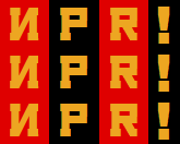
npr
- Thread starter Berserk
- Start date

Needs more DEUTSCHLAND

holylampposts
-member-
That's the font for the tracklist on the back of Nocturnal OperaBerserk wrote:That typeface is terrible, holylampposts

In Soviet Russia, NPR supports you!
@lampposts: Holy crap, you're right!
 How did you discover that?
It definitely looks better when you use capitals or an actual word.

I thought this Soviet typeface actually made it look kind of elegant. It's amazing how much entertainment can come from free online fonts and mspaint!
- Joined
- Dec 15, 2004
- Messages
- 1,773
Berserk wrote:The new comic sans: Calibri. I see people using that font on signs and announcements all the time, and it looks terrible. As a 10-12 pt. font, it's probably the best sans serif out there. As anything larger than that, it looks like shit XD
EDIT: Oh, and it has rounded edges too.
EDIT EDIT: Couldn't resist

isn't that just because it's the default for word2007
flowersofnight wrote:http://bancomicsans.com/boi de memoire wrote:round ends are more comfortable, in general
Complete forgot about comic sans
soviet font ! 
flowersofnight wrote:http://bancomicsans.com/boi de memoire wrote:round ends are more comfortable, in general
lol!
i didn't even noiced how Comic Sans is invading brands and announcements xDD

Amatsu
-member-
- Joined
- Jan 1, 2006
- Messages
- 4,576
holylampposts wrote:That's the font for the tracklist on the back of Nocturnal OperaBerserk wrote:That typeface is terrible, holylampposts
That's where I knew that from! I've always thought the font's name was retarded.
*snap!* That's the best!Cerceaux wrote:
Anyway I think we can all agree that both #1 and #2 are better than the OLD logo:
http://en.wikipedia.org/wiki/File:NPRLogoOld.png
EDIT: and a real old-school one from the 70s:
http://media.photobucket.com/image/npr% ... -1970s.jpg
http://en.wikipedia.org/wiki/File:NPRLogoOld.png
EDIT: and a real old-school one from the 70s:
http://media.photobucket.com/image/npr% ... -1970s.jpg
Amatsu
-member-
- Joined
- Jan 1, 2006
- Messages
- 4,576
flowersofnight wrote:EDIT: and a real old-school one from the 70s:
http://media.photobucket.com/image/npr% ... -1970s.jpg
I feel bad for logos made before photoshop existed. They didn't even have a chance.

- Joined
- Jan 30, 2007
- Messages
- 2,506
You should have seen the sick logos I designed for my fake band in junior high with nothing but a pencil and lined notebook paper (and a dream).
They pretty much all looked like the Metallica or Iron Maiden logos.
They pretty much all looked like the Metallica or Iron Maiden logos.
Apparently they used it on the movie poster for There Will be Blood, and I found a designer's blog that mentions using it in some RPG manual. If it's used for all these commercial things, you'd think someone would have some sort of claim on it or something. I really want to know who made it and why they called it that XDAmatsu wrote:holylampposts wrote:That's the font for the tracklist on the back of Nocturnal OperaBerserk wrote:That typeface is terrible, holylampposts
That's where I knew that from! I've always thought the font's name was retarded.
windings is the right answer here
haha i knew that would be awesome
- Joined
- Jan 20, 2005
- Messages
- 1,928
Yes, that's the bestBerserk wrote:First one is lowercase like it's supposed to be, but the second one is way more fun.
I think it must be saying that NPR is a pirate flagship organization that plans on using solar radiation to KILL US ALL!!!1!